Celebrity makeup artist, Nathan Johnson (@nathanwalnut), is QC Makeup Academy’s Executive Makeup Artist and is based in New York City. For Halloween this year, Nathan shares his ideas on QC’s special effects makeup submissions!
Great work deserves to be celebrated. And given that Halloween is right around the corner, I wanted to praise some brilliant looks created by our QC students. I hope that they will inspire you to create something spooktacular for your evening of trick or treating—or even better, to enter QC’s annual makeup contest.
Adela Simpalean: Jack of all Queens
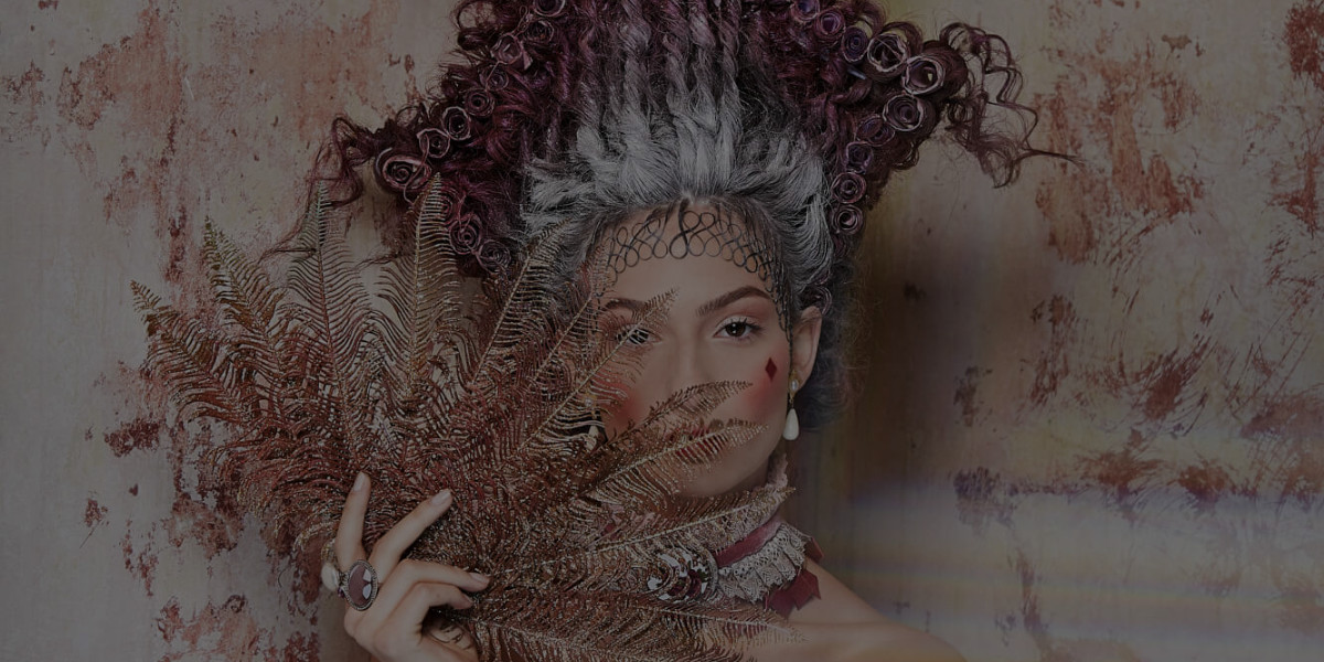
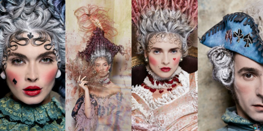
There is no other word for this series of looks than…superb. Every aspect of this shoot—the hair, set, wardrobe, photography, and makeup—is fully editorial quality. I believe that nothing is better than a series of images that tell a cohesive story. That is exactly what happened here. Every element in this shoot is vivid and precise, leaving no room for the audience to get pulled out of the magical story.
The makeup application is excellent. In all four images, the powdered-down foundation is expertly applied and immediately evokes the period makeup feel. The placement of the blush is spot-on, and the subtle eye makeup makes the eyes a focal point. The queen of spades, the knave, and the queen of diamonds are all perfect. When it comes to adding accents to a makeup look, most artists tend to go overboard. But Adela used the suit markers subtly, making them all the more powerful.
I have two small recommendations for the Queen of Hearts. Firstly, soften the blush on the photo left side, so that the two cheeks are symmetrical. Secondly, smooth the inner corners of the lips the way you did on the Queen of Spades. These are two micro-adjustments on an exceptional work of art.
As mentioned earlier, this makeup series is a prime example of how makeup, hair, wardrobe, lighting, set, and photography can come together to strike gold. If you have not submitted these looks to magazines that accept editorial submissions—you should do that today.
Chantal Lofstrom: Broken Knuckles
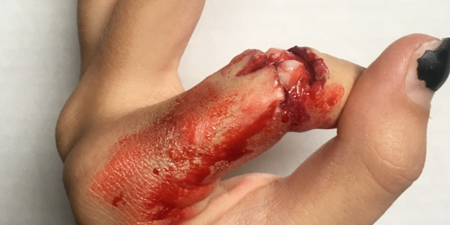
This is a technique that has been done many times, but this is an example that ranks with the very best of them. Chantal’s work checks several boxes of excellence. First, the anatomy is correct and the effect is believable. Second, the makeup is applied with so much precision that you cannot separate the real hand from the illusion. This is the mark of an HD-ready special effect. Third, the finished product is so realistic that it has a visceral effect on the viewer. Brilliantly done.
There are only two tiny adjustments I would offer up to really slam the look out of the park. Firstly, when people get a traumatic injury that tears the skin, there will also be bruising. Using a stipple brush to apply the appropriate reds, purples, and burgundies around the torn skin will do the trick. Secondly, add a touch of black into the deepest part of the wound. This will give the wound depth, and make the high areas look higher and the deep areas, well, deeper! Congrats on some amazing work.
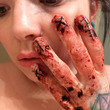
There are so many small details in this application that the moment I think I’ve seen them all, I discover another. Despite the apparent complexity, what Danielle has done is actually a series of very simple techniques. What makes this look extraordinary, and incredibly difficult, is her perfect application of these techniques.
The scars and gaping wounds in the hand are extremely realistic. The masterful use of black, makes the wounds look far deeper and more dramatic than they actually are. By having a combination of healing scars on the removed nails and open areas of rot and infection, the work becomes textured and begins to tell a fascinating story. The stitch work is gristly, and having a few stitches break away is genius.
From the illusion you created, the wounds on the nails seem to have been inflicted in the past. And for older wounds, the amount of fresh blood used on the hand is a bit unrealistic.
The rotting gouges also look like they are an ongoing wound, so a slow sweep of blood on and around would be more realistic. By making sure every element of your effect honors the continuity of the story, you can make your final look very believable. Again, this is only a tiny suggestion on a great makeup look.


Thank you, Nathan, for the resourceful critique – it is a gift I’m honoured to take and of which I’m motivated to make good use 🙂