Thank you to everyone who participated in QC’s Halloween Makeup Contest, Trick category. Below is Nathan’s critique of the five finalists. Click here to view Azzi’s critique on the Treat category finalists.
Here’s what Nathan was looking for:
Effort: Higher points will be awarded to those who combine a diverse use of skills with an incredible use of imagination in order to create a detailed and captivating horror look. The makeup application is fundamental to the contest, but the more visually stunning the final image is—through the tasteful use of hair, costume styling, props, and accessories—the more points will be awarded.
Skill/Technique: Higher points will be awarded to students who demonstrate the use of polished makeup skills, detailed application, symmetry (when it is supposed to be symmetrical), and a diverse use of techniques. There are no rules in horror, so don’t be afraid to charge, refine, and create new techniques.
Photo Quality: A good quality image is essential. The photograph should be clean, crisp, and appropriately lit. Higher points will be awarded to images that look like they could be in a horror magazine or media feed. Points will be deducted for images that are blurry, messy, or have cluttered or thoughtless backgrounds (e.g. messy bedrooms, bathrooms, etc.). This doesn’t mean that you need an expensive setup, it just means you need to clean the oils off your camera lens, or to borrow a better phone or camera. Incredibly gentle retouching is acceptable, although your makeup should be doing the perfecting on its own. Blurred skin, visible or over-retouching, and filters will result in a loss of points. Any images that are not a realistic version of the artist’s actual work will be disqualified.
Fun/Originality: Create work that is original and from the deepest recesses of your imagination. I expect to see wonder, terror, beauty, and horror! Have fun every step of the way! If you copy or tweak an influencers existing work, points will be deducted. You are an artist—don’t copy.
Story: A few sentences about your creation, and the story behind him/her/it, can do a lot to sell your image. Don’t fall into the trap of telling what you did with the makeup, instead tell the story of who or what this person or creature is. The stronger your story and concept, the more precise and clear your application will be—and the more points you’ll be awarded.
Finalists & Scoring
I want to congratulate all the finalists and semi-finalists. This is some of the best work I have ever seen from a QC contest. Since we are a school and education is paramount, I have decided to offer both critiques and compliments in the feedback. I hope that this feedback will give both the finalists and the readers an opportunity to grow their makeup skills. All of my feedback is offered with love and respect for the hard work and effort put in. Thank you all for participating—you are all gifted and I expect to see more extraordinary things.
– Nathan Johnson
Artist: Ashlyn Slade
Story
This dispossessed clown is summoned only for the month of Halloween and prays upon his coulrophobic victims in the dead of night.
“Would you like a balloon…”
Score
- Effort: 3/5
- Skill/Technique: 2/5
- Photo Quality: 3/5
- Fun/Originality: 5/5
- Story: 5/5
- Total Score: 18
Comments
In my opinion, there are only two things scarier than a clown (monsters that can climb walls, and anything that can mysteriously float in a darkened corner). So you have already checked the scaredy-cat box for me! The coloration is great—I think it really sells the concept. The red on the inner cheeks, streaking down from the dark circles is a masterful touch. When applying prosthetics, it is very important to make sure the edges blend seamlessly into the skin. On the brow pieces and the cheeks, the edges are very rough and visible. I appreciate the horns that are growing out of the scalp, but the use of the scotch tape to adhere them immediately takes away from the image. Had you decided to maximized that, making it look like the cheeks, chin, and nose were all a crazy person’s disguise that was put together with tape, glue, and staples — that would have been extremely eerie.
Artist: Charley Arnold
Story
Mental health cannot be seen, many of us wear a mask every day to hide our inner fears and torment… but if that mask could be peeled back, is this what we would see?
Score
- Effort: 5/5
- Skill/Technique: 4/5
- Photo Quality: 4/5
- Fun/Originality: 4/5
- Story: 4/5
- Total Score: 21
Comments
This is a very timely and appropriate make up. I would call it more of a statement piece than I would a horror trick. This is a combination of two makeup looks that has been done many times: the pulling back the skin to reveal (most often, a monster), and the anti-bullying, writing-on-the-skin makeup. I think it was a stroke of genius to combine the two elements. The wrinkling of the pulled-back skin is very well done, but I would have liked to see you commit to more, using more pins or tacks down the face to pull back the skin. A bit more attention to the highlight and contour of the area of pulled skin would have added some amazing dimension. It would have also been a unique touch if you had the skin pulled back on the chest as well. The writing on the skin and the artistic take on bruising are artful. One of the downsides of combining two popular makeup look is that there is a lot to compare it to. If you are going to borrow inspiration (as the best artists do), be sure to do it as least as good, if not better! In this case, some more detail, highlight/contour, commitment, would have pushed your look to the next level.
Artist: Monique Martin
Story
Ringmaster From The Afterlife.
Jules was once a fun-loving ringmaster at the carnival, but one night at a performance she gets bitten by a zombie and gets infected in necrosis and dies immediately. Only to rise up in the afterlife and entertain the dead souls and torture the living!
Score
- Effort: 4/5
- Skill/Technique: 3/5
- Photo Quality: 4/5
- Fun/Originality: 5/5
- Story: 4/5
- Total Score: 20
Comments
This is a great example of a head-to-toe commitment to an image. The prosthetics and the peeling skin are really well done, as is the coloration. I think special attention should be drawn to the photo left wrist. That is an excellent detail. The one small bit of advice I would offer is knowing when to edit. If one or two small prosthetics were left off the face, the little bit of real skin would make the rest of it look more realistic. And if a piece of your prosthetic does not look as well applied as the rest, it’s best to take that off or just crop the image to cut it out. In this case, I am citing the curling edges of the prosthetics on the legs. On a final note, when someone is dead to the point of rotting, their blood and wounds should no longer be bright red. Adding a touch of black to the wounds would make your model appear more realistic. This is great work and deserves to be in the finals.

Score
- Effort: 3/5
- Skill/Technique: 4/5
- Photo Quality: 5/5
- Fun/Originality: 5/5
- Story: 5/5
- Total Score: 22
Artist: Maxwell Shea
Story
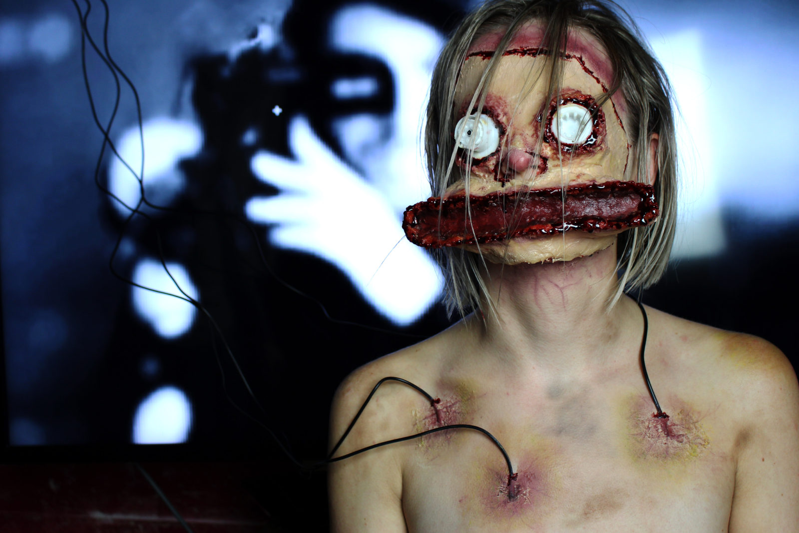
“Did you happen to catch that?” he said as he pointed towards the TV screen. A brief circle, not even lasting a second long, had appeared and gone away, briefly drawing my eyes away from what I was watching.
“That was a cigarette burn. You see, film has a very human quality to it. It has scratches and marks all over it and, much like a human body, will break down. Over the years, it will begin to mold and fall apart.” As he spoke to me, I knew today was the day. I had been stuck in this basement for what seems like a lifetime. I’ve watched him tinker around on this project since the moment he brought me… home. The freezing steel of the table below me numbs my body.
“If you think about it, it’s all just an extension of the human body. It’s all flesh.” These were the last words I heard before it all went black.
Comments
This is a deeply unsettling image. The bruise and vein work on the chest is magnificent, as is the entry point of the blood tubes. The story, or rather the memories of the character’s last moments, are chilling. Nothing is better than a story that allows the audience to look at an image and scramble to put the pieces together in their own mind. I do love the mutilated face mask, but I am a bit confused as I consider the full image.
Was the person’s face replaced with a plastic mask, or was their face mutilated? My main suggestion is a request for clarity between a mask and a tortured person. Had this committed to one of the two directions, it would have been positively gristly.
There is so much realism and detailed attention on the chest, I wish that carried into the molding and application of the prosthetic. The prosthetic along the chin doesn’t look like it is attached at all. The best advice I can offer is, never make an effect just to make it. You have to consider every aspect. What would have caused it? Why it was done? How was it done? Could this really be done to a person? Those questions and more will ensure even the most shocking effect has its roots in realism. Which, at the end of the day, sells it to the audience. This is really great work—I am just offering a few micro-suggestions. Congratulations.
Artist: Jessica Pykett
Story
Octopus
Score
- Effort: 5/5
- Skill/Technique: 4/5
- Photo Quality: 5/5
- Fun/Originality: 5/5
- Story: 0/5
- Total Score: 19
Comments
This is an incredibly unique submission. By all accounts and standards, it is captivating and original. The prosthetic fully blend in with the rest of the face, other than the small ridge on the forehead. But it is handled in a way that made the ridge looks like a rupture on the skin due to the emerging octopus. The wound lacks the realistic amount of blood that would accompany such a traumatic injury, but I think this worked in Jessica’s favor. Too much blood would have destroyed the stunning image. Sometimes, in editorial, the final effect trumps realism. The glass eye is a captivating touch and made even more powerful by the model’s real striking eye staring out from behind the tentacles. The blood dripping off the lip is a lovely detail.
Had Jessica taken the time to craft even the shortest story to go with this masterpiece, it would have been the winner.
Congratulations to Maxwell for winning the 2018 Halloween Makeup Contest, Trick category!
Maxwell wins a Nars’ “7 Deadly Sins Audacious Lipstick Palette”, a set of 5 latex prosthetics, two bottles of special effects blood, an injury wheel and an RMG bald cap wheel, a multi-use stipple sponge, and black and red cream makeup.
