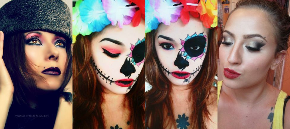
We have so many talented artists here at QC, and we love to provide the opportunity for them to show off their best work on our QC Makeup Academy Student Showcase.
We asked QC’s Executive Makeup Artist, Nathan Johnson, to pick a few amazing samples from the Student Showcase and critique the artists’ work. Here’s what he had to say!
Karmela Kurowski

I happen to think that the various takes on the sugar skull makeups are very overdone, but this one impressed me. In this make up application there is proof of an enormous amount of skill.
The base application was done with such a graceful touch that it looks more like the pigment vanished from the skin than it does a face painted very pale. This balance is difficult to achieve.
I am also impressed by the evenness of application. The work on the photo-left eye is beautiful. The cat eyeliner is precise and the pink on the lid diffuses beautifully into the crease. The brow is perfectly shaped and I adore the softness of the curve and the light-handed touch to the innermost section of the brow. The soft precision of the photo-left eye/brow plays well with the darkness of the photo-right eye.
My favorite aspect of this application is the work on the nose—it is artistic and beautiful. The crisp lines create an illusion of depth that makes the hole recede into the face in a way that is artful, not grotesque. The nose and eye both give a great sense of illusion and I love that.
The multiple shades used on the lines extending from the mouth give great dimension and the varying stitch directions add interest. This is beautiful and well-applied. For me to look at a sugar skull and do anything other than yawn, the artist behind the work needs serious skills, and Karmela has them.
Brittney Vernacchio
Brittany is demonstrating some great artistry in this application. The foundation is applied with a light hand, making it look more like beautiful skin than foundation. The blush and contour are soft, but still effective, giving a beautiful glow from within. In my opinion, if you do not recognize the foundation, blush and contour as product, but only see the person as having perfect skin, you’ve done your job well.
When I was starting out, lips were impossible for me, so I always notice a perfectly applied lipstick. The fatal mistake of any lip application is not going all the way to the inner corner. It’s clear Brittany has a mastery over the mouth. Her application is perfect.

The brow application is awesome as well. I adore the feathery strokes that she used on the inner most section of the brow. And the arch is perfection!
The blending in the eyeshadow is beautiful. It is the perfect illustration of graduation of color. As you look at the inner corner of the eye and move outward, you can see every hue change as it moves from a soft champagne to the deepest black. This is not easy folks! The hard line of black at the outer corner of the eye adds a beautiful contrast to the otherwise soft look. Well done!
Vanessa Pressacco

I happen to love this example of Vanessa’s work. It has elements of the first half of the 1900s but it is also very unique and modern. A great artist can steal from the past and create something very fresh and new.
I am often not a fan of a bold color that has been swept from lash line to brown bone, so I am always pleasantly surprised when someone makes me reconsider something I normally dislike. Because Vanessa balanced the amount of bright pink with such a bold, black lower lash line, the look goes from a potential disaster to a masterpiece. Great artistry can hover on the knife’s edge of a mess. It is knowing how to manage and balance things that might not normally work that shows true genius.
I think the uniqueness of the lips speaks for itself. The base color is a near perfect match to the spot where the black meets the pink on the upper lid. And the dots! I am hypnotized by how they appear like pixilation. This is a beautiful and fascinating example of Vanessa’s work. Bravo!

Very lovely work. Good to see some other students work 🙂
Beautiful work!